Client
Designlab UXA
Individual project
Duration
Jul - Aug 2020
4 weeks, 20 hrs / wk
Contribution
UX design, research, visual identity, copywriting, prototyping and testing, responsive design
In reading what
Jamil Zaki has summarized as 'catastrophe compassion', I was interested in designing something that promoted community development and cooperative behavior. Several things inspired this idea:
- The rise of mutual aid and universal generosity and empathy that came out of Covid
- Financial concerns and resource shortage due to Covid, and in general among the Millennials who entered the workforce without gaining financial security
- Wanting or needing certain single-use items, tools, equipment, that one can't necessarily justify purchasing
- Desire for a more sustainable consumption model among the younger generation, who take issue with the linear consumption model of 'make - consume - dispose'
Household items can be expensive and not cost-effective for lots of people, especially items that are only used a few times and left to gather dust.
Design a way for people to get access to home and resource needs through borrowing and lending, and strengthen community engagement and development while doing so.
To determine how Neighborly would compete in the market, I researched similar secondhand and rental apps and did a heuristic evaluation of each. I got a sense of the successes and painpoints of each platform, and types of information that is expected.

I got insights from 8 users through a mix of interviews and survey responses, all of whom have experience using at least one of the aforementioned platforms.
To start, I wanted to know which platforms the participants preferred, and what features they valued. Among the 8 participants, the most favorable secondhand app is Facebook Marketplace. Users valued the ability to see other people's social profile, with trustworthiness being the common denominator.
"I like FB Marketplace because I'm more confident in the person if I can see their Facebook profile"
While my target audience for this is for young, digitally savvy users who prefer consuming secondhand, there is an obvious difference between shopping / selling vs. borrowing / lending.
Most participants do lend and borrow occasionally (sometimes frequently) - items such as books, games, small specialized kitchen appliance, baby stuff, etc. This allowed me to gauge the kind of items and categories needed for Neighborly.
When proposing to the participants the Neighborly app idea, users showed interest based on two mental models:
Primary and secondary research revealed that users have different motivations for engaging with an app similar to Neighborly. Using examples of use cases that were mentioned in user interviews, I created different user types, with a focus on supporting the goals of Michael and Aaron.

These scenarios (e.g. needing equipment for creative projects, a desire to know neighbors and engage with them, ability to make passive income) helped give me a clearer picture of who to design the app for and what their motivations are.
With that in mind, I visualized the whole process of listing and renting, categorized into before, during, and after using the app into a spreadsheet, which helped clarify the type of tasks, big and small, that needed design attention.
I took the skepticism from my interviews and envisioned essentially a worst case scenario, as well as the aspirational emotional states that I wanted to create through my design. Visualising the emotional journey of using the app, helped illuminate user pain points and the design opportunities to address them.

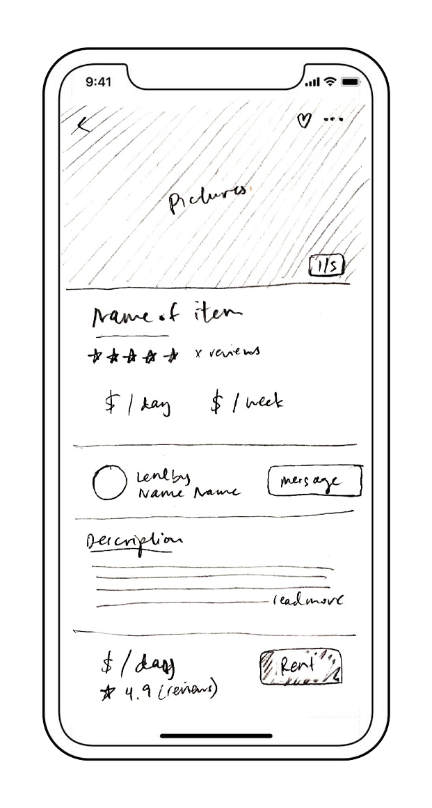
I had a visual idea in my head at the beginning of the design state, and as the sole designer for this project, I worked rapidly and jumped straight from sketching wireframes out to creating the prototype in Sketch App. Any features and notes that I needed to refer to, I entered into a spreadsheet to provide myself with a feature roadmap.

Home

Category

Product

Message
I wanted to test a working prototype with users as quickly as possible, and focused on two primary user flows: borrowing an item and listing an item, and one secondary flow: helping a neighbor in need. The designs were completed in Sketch, but because of Sketch's limitations with interactive prototyping, I decided to communicate the app's interactions and transitions using Adobe XD.
As soon as all the frames were designed, linked, timed and animated, I tested the app design on 4 users, and asked them to go through all three flows (renter, helper, and lister).
The first iteration of the home page design gave focus to the community feature, but upon conducting usability testing, participants revealed that renting and borrowing are the key reasons why they would go on the app, not to offer or ask for help.
"People are selfish before they are helpful"
First iteration

Gave focus to the 'mutual aid' feature of the app, which upon testing, was not the users' primary task when going on Neighborly.
Final design

Highlighting the ability to find and rent items from their neighborhood, and pushing the mutual aid feature further down.
I instructed the participants to first play the role of someone who wants to rent a pasta machine from Michael. The participants were mostly satisfied with the renting process. They revealed that most of the confusion was in the messaging function to arrange the transaction.
One participant noted that the messaging function made sense because the transaction is not of the traditional buy/sell, and supposedly within their neighborhood, but they were confused by what they could actually write or say upon landing on the messaging page. I therefore iterated the design with pre-written responses, and have the lister start the conversation like the Airbnb model.

The mutual aid feature is a way to highlight community that comes not just from sharing material resources, but also from lending a helping hand.
The feature provides a way to broker interaction between helpers and those in need. I created two versions of the mutual aid help board, one where people publicly comment to offer help, and one where users can directly message the person who created the post.
Upon conducting A/B testing, I found that there was no need to put privacy barriers through DMs. A testing participant noted when seeing the 'message' button that without public accountability, there's little incentive for them to reach out.
Direct message

Final design*

* See final design below, with interaction and animation of the hero image and feature title.
I took a lot of design inspiration and patterns from Facebook Marketplace's and Airbnb's listing design, and wanted to make sure each step of the process was straightforward.
However, one critical point that confused users was adding different price rates. Based on the layout and lack of instructions, participants were not aware that not all rates - hourly, daily, weekly, and monthly - had to be filled out.
First iteration

Final design

By changing the layout to "Add rate" buttons, the ability to add different rates became decision points, rather than form inputs that users expect to fill.
The videos below show the final iOS app designs.
Rent anything
List and earn
Help a neighbor
Designing a new app from scratch takes much longer than a month. If I were to continue developing this idea, I would have to do extensive testing, and further the design into a high-fidelity prototype with profile / account pages fleshed out, what the onboarding process would look like, and finding different incentive avenues. I'd expect that once a prototype is created that the app would enter in beta to see what features of the app need improving, whether people will actually use it, and what revenue streams the app can adopt.
- Content strategy is crucial - A lot of time was wasted because I didn't conceptualise the content from the beginning. I spent so much time on mapping flows and user journeys that I ultimately had trouble articulating the brand's personality and tonal direction when it came to the designing stage.
- Allow usability testing to reveal issues - While my initial goal was to create a prototype and test as quickly as possible, I wasted a lot of time overthinking and designing aspects of the design that were unnecessary and outside of the flows. As a designer, it's easy to overanalyse and get into the details. This inevitably was a distraction from the bigger issues that required a step back and outside perspective that I could have only gotten through usability testing.


